
For open plan living room render lighting, the problem is almost never "not enough light". It's that the lounge end sits next to a wall of glazing and the kitchen end sits eight or nine metres back, and a camera can't hold both. Get the exposure right for the sofa and the kitchen island goes muddy brown. Expose for the kitchen and the windows blow out to white.
My fix is to treat the room as two lighting zones that share one sun, and to accept a small, believable amount of help on the darker side. Here's how I set it up in Blender and Cycles, and where I think most open-plan renders go wrong.
Why open-plan rooms are harder than they look
A typical open-plan apartment I get from an architect is around 40 to 60 m² of kitchen, dining and lounge in one volume. The glazing is usually on one long side or one short end. Daylight falls off fast with distance from a window, and that's physics, not a render setting. A real camera standing in that room would show a bright lounge and a kitchen that looks a stop or two darker.
Human eyes adapt as you look around, so the space feels evenly lit when you stand in it. The render doesn't get that luxury. It has one exposure for the whole frame. One.
So the brief, even when nobody writes it down, is this: make the image feel the way the room feels to a person, not the way a cheap camera would record it. That means lifting the deep end without making it obvious, and holding the window end back.
Start with the sun, not with lamps
I always set the sun and sky first and render a quick clay version (all surfaces one light grey) at about 1200 px wide. That takes a few minutes and tells me more than an hour of tweaking materials. If the light pattern on the floor is wrong in clay, no amount of oak texture will save it.
A few things I check at this stage:
- Sun direction against the real orientation of the plan. If the drawing has a north arrow, I use it. A south-facing lounge in Barcelona gets a very different afternoon from a north-facing one in Vilnius.
- Time of day. Mid-morning or mid-afternoon usually gives sun patches on the floor without harsh vertical shafts.
- Whether the sun actually reaches the kitchen. Often it doesn't, and that's fine, as long as the sky does.
Once the clay pass reads well, I add materials. Floor colour changes everything here. A pale oak or polished concrete floor bounces light deep into the room; dark walnut or slate soaks it up and makes the kitchen end visibly darker. I'll mention this to the client early, because it's a design decision, not a render problem.
Balancing the kitchen end without fake-looking light
This is where open plan living room render lighting either looks real or looks staged. The usual trick is to fill the dark end with invisible area lights. It works, technically. It also kills the gradient that makes a room feel like it has depth.
I go in this order, and I stop as soon as the image reads:
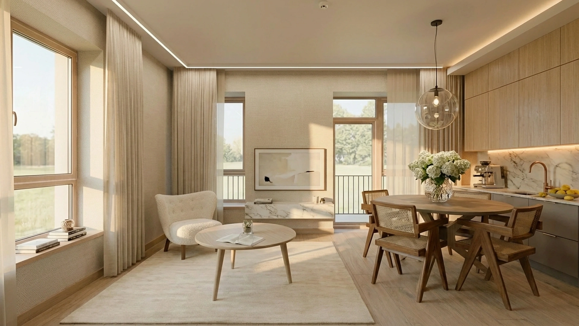
First, real light sources that would exist in the room anyway. Pendants over the island, under-cabinet LED strips, a cooker hood light. In daytime shots I keep them dim (they shouldn't look switched on for effect) but they add warm local pools that pull the kitchen forward. Under-cabinet strips are especially useful because they light the worktop, which is the surface the eye goes to first.
Second, and only if the fittings aren't enough, a very soft, large fill that I place just inside the glazing line, sized close to the window opening itself so its shadows match the direction the daylight already comes from. Think of it as extra sky rather than a lamp. Low strength, big size, no visible highlights on glossy surfaces. If I can see its reflection in the oven door, it's wrong.
Third, exposure and tone mapping. I use AgX in Blender and pull the highlights down so the window end keeps some detail outside. Then I lift exposure by a fraction of a stop. That's usually enough. Really.
What I don't do is make the kitchen as bright as the lounge. A slight falloff, maybe two thirds of a stop, is what makes the image believable. Remove it and the room starts to look like a catalogue set with no ceiling.
Windows: the part everyone overexposes
Blown-out windows are the most common flaw I see in open-plan renders, including ones from big studios. It's tempting, because a white window hides the fact that there's no real view behind it.
I'd rather put a proper exterior behind the glass, even a simple one. A photographic backplate of a street or garden, slightly brighter than the room and a little soft, does two things. It tells the viewer where the light comes from, and it gives the image a sense of place. Buyers of an apartment want to see that there's a balcony and a tree, not a white rectangle.
So why do so many studios leave them white? Speed, mostly. Curtains help too. A sheer curtain on part of the glazing softens the light on that side and gives the eye a texture to rest on. It's a cheap prop that does real lighting work.
Camera choice matters more than you'd think
Where I put the camera decides how hard the balance is. Shoot from the kitchen toward the windows and you're pointing into the light, which is the hardest setup. Shoot from the window side back toward the kitchen and the light falls with the view, which is easy but hides the glazing.
For most open-plan projects I suggest two angles. One from the back corner of the kitchen looking diagonally across to the lounge and windows, which shows the whole volume. And one closer view of the kitchen itself, lit mostly by its own fittings and the bounce. Two images. Two exposures. No compromise, and no arguing with physics.
Last spring an architect sent me a 52 m² flat and asked for a single wide shot "that shows everything". I did a test from the entrance. It showed everything and sold nothing, because the kitchen was a dark strip in the background. We switched to the two-angle approach, and the kitchen view ended up being the image they used on the listing.
What I'd actually do on your project
If your open-plan space has glazing on one side only, plan for two camera angles from the start rather than one heroic wide shot. At my published rate of EUR 250 per interior camera angle, that's EUR 500 for the pair, and you get one image that sells the volume and one that sells the kitchen. Three angles, which adds a dining or detail view, come to EUR 675 with the multi-render discount.
Tell me the floor finish and the real orientation before I start. Those two facts shape the light more than anything else, and changing them after the first preview counts against your revision rounds (two consolidated rounds are included).
And please don't ask for the kitchen to be "as bright as the living room". You'll get it if you insist. It just won't look like a real home.
You can see how this plays out in my penthouse open-plan study, and there are more kitchens and lounges in the portfolio. If you have plans or a SketchUp or Revit model, the interior rendering services page explains what I need, the architectural rendering prices page lists the rates, and you can ask for a non-binding quote through the contact form. First preview usually lands about three business days after a complete brief.